Speech therapy software
Grew Sales 30%
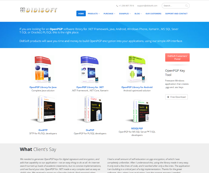
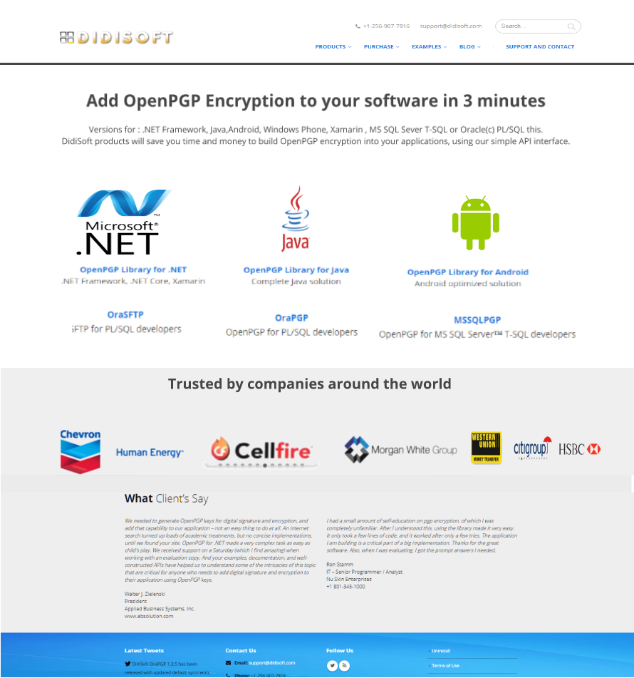
Original Design
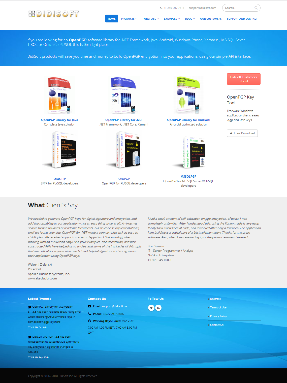
Improved Design
|
|
|
| WHO |
DidiSoft.com |
| WHAT |
Redesign Home Page to improve conversions
(downloads and Sales) and decrease Exit Rate. |
| Result |
16.3% increase in visitors
(due
to reduced bounce rate. I.e., fewer visitors bounced away)
36% Longer time on-page
Users
spent 36% more time on the Home page.
Grew revenue 30%
-Atana Krachev, CTO
View Anaytics (Details)
|
Background
Atanas, the founder, was working as a software developer. One his
projects was creating a PGP Encryption library. He then improved it
to make it reusable throughout the company. However his boss
chastised him for "gold plating" it. So he launched his own company.
He read quite a bit about marketing, and his company was profitable
(and supporting his family) but knew his site could be improved. He
discovered me through an
online community for software developer entrepreneurs..
I redesigned his home page and increased his sales almost
immediately. That seems like a surprisingly fast result until you
see the visual impact of just a few changes.
Goal
Improve conversion rate for the Home Page in order to increase
downloads (and eventually sales). This company makes a PGP Encryption
Library which they sell to software Developers.
Issues Found
- Headline is lost with white text on dark background,
in a small font, with a "wall of text"
- Product package "photos" are visually confusing with
the curved design, etc.
- Logos on product packages are hard to recognize.
- The red "..portal" button is the most dominant
- Remove Home and Clients from menu. We are adding
Clients to the bottom and you don't need a Home link on
the Home Page. Also, they could link the Log at the top
to the Home page. (as Jarod Spool's research
shows: every link you add reduces clicks on all other
links)
- Add Customer logos to the bottom of the page to
establish credibility trust and peer validation.
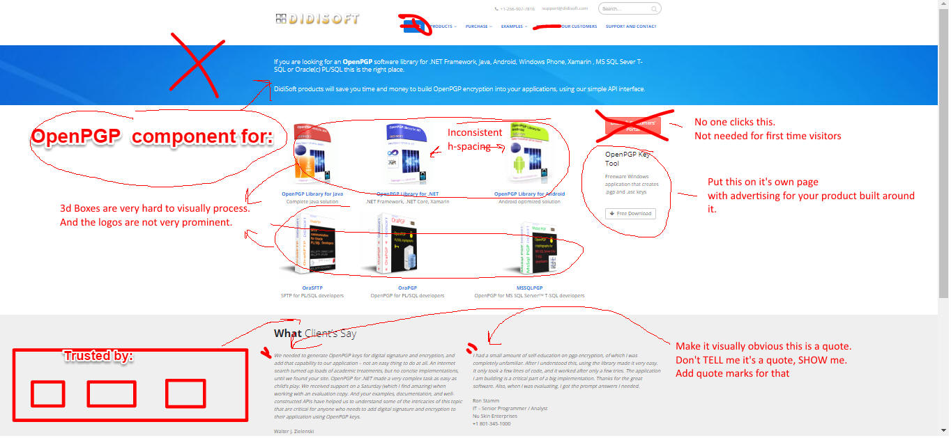
Note
- I would have preferred to make the header (with logo, menu, etc.) reverse
video (light text with a dark background) to de-emphasize it and create stronger
contrast for the headline text. However, that would have been much more work for
the client. I wanted a quick early win to establish trust and confidence.
- I asked them to do an A/B test of the old
vs. the new design. So if you visit there's a 50% chance you'll
see the old design.
Their traffic is quite
low so that test may take quite some time to reach statistical
validity.
Result
"We had some serious design flaws on our homepage that made it look unprofessional while at the same time we had to deal with some very big and serious clients.
Clay's redesign improved the overall first time experience which resulted in almost immediate increase in our flagship product sales."
- Atanas Krachev, CTO DidiSoft