|
WHO | Morespeech.com web app |
| WHAT | Teach brain-injury survivor how to speak more clearly. Goal: survivor use program independently. |
|
| Result | Success rate improved
450% |
I designed software that brain-injured adults can use independently for speech & language therapy. This Case Study focuses on one particularly challenging design problem for which we measured effectiveness.
I worked with an Aphasiology researcher (Dr. Richard Katz) to design a program based on a standard treatment for Apraxia (articulation disorder). Based on his explanation of the approach, I provided him with design sketches. I designed the UI based on his feedback. I tested a prototype using fivesecondtest.com.
I consulted with Dr. Katz (above) as well as interviewing patients with the Apraxia disorder this software addressed, as well as their caregivers (usually the spouse.)
Paul the Patient
Paul is 68 years old. He had a stroke which affected his articulation (speech clarity), his word-retrieval (thinking of the right word to say) and reading comprehension, and has right-sided paralysis. He's right-handed so he now uses the computer with his left hand, which he finds quite difficult. Before his stroke he used the computer to manage their finances, including simple spreadsheets. He’s comfortable using the computer.
Carol the Caregiver
Carol is Paul’s wife. She’s 70. She does light computer work, searching for recipes online. She is a little under confident about learning new things on the computer.
Tina the Therapist
Tina is their speech therapist. She’s very busy and has little spare time because she has to maintain high productivity and can only bill for hours she spends with Paul. So she has no outside time for learning new things. She is 55 years old and comfortable with the computer. But she has never downloaded or installed software. She’s also nervous about learning something new in front of her patients (looking dumb, etc.)
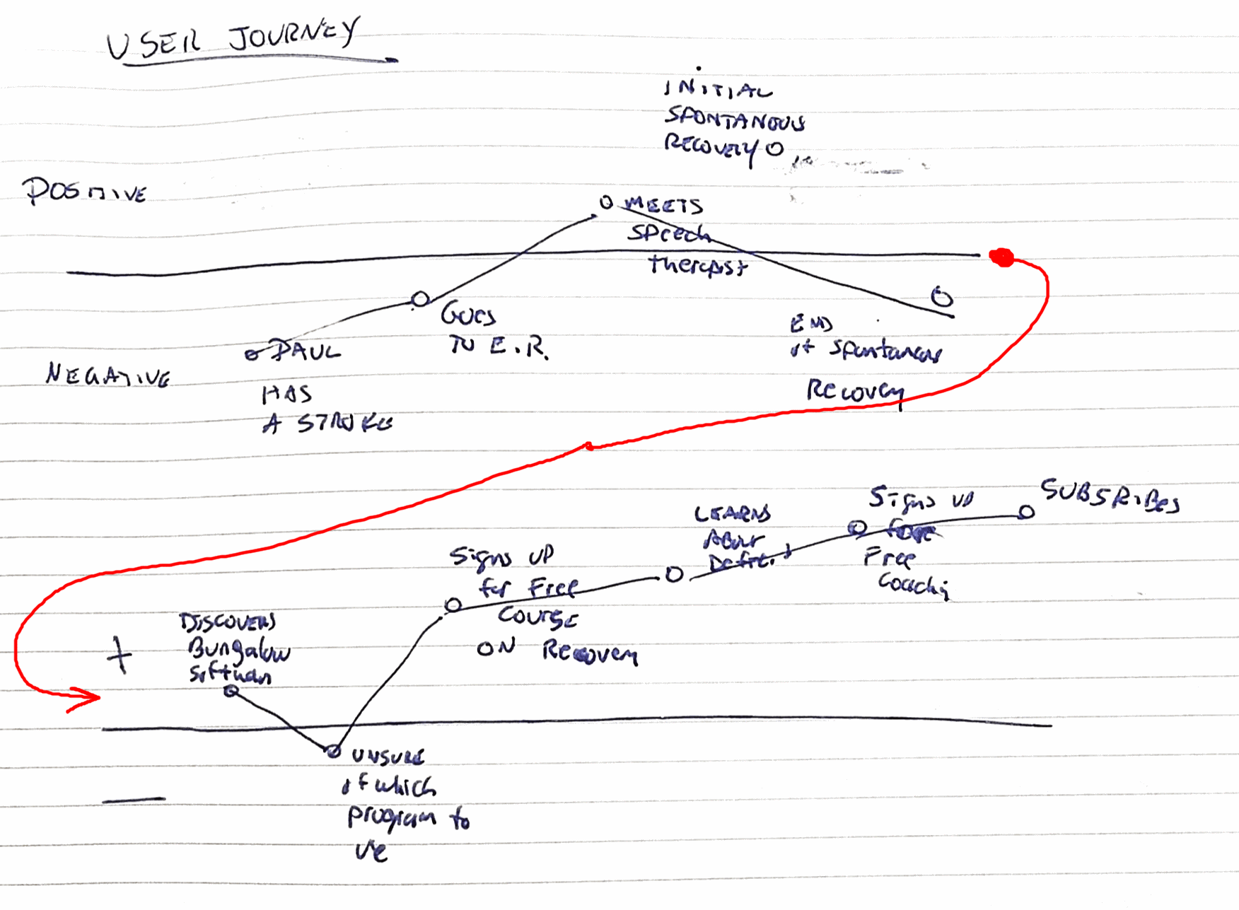
Carol the Caregiver sees an advertisement for MoreSpeech.com, interactive speech therapy software she and Paul can use at home. She shows it to Tina and points out that it was created by a speech therapist. Tina is a little nervous about learning something new in front of Paul & Carol. She also doesn’t use her computer for therapy. She usually uses flash cards and worksheets. But she can see Carol is excited because she thinks Paul would enjoy this. She’s willing to try it.
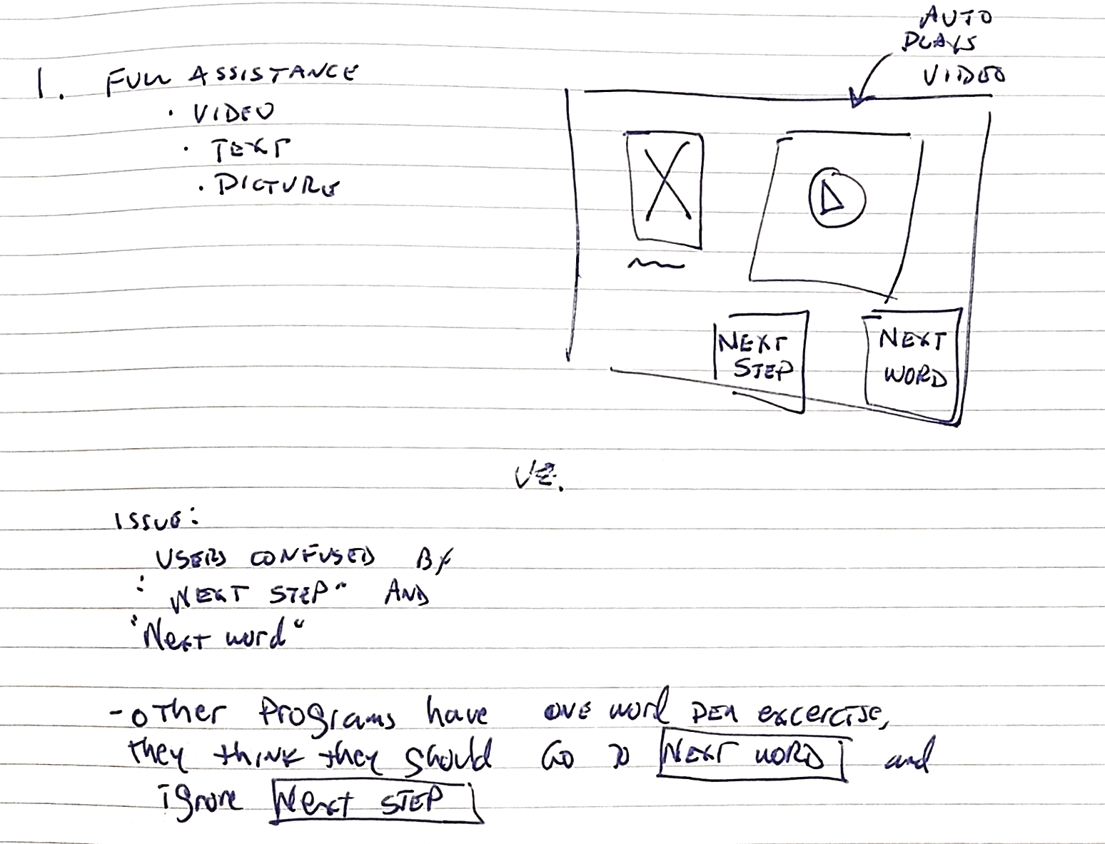
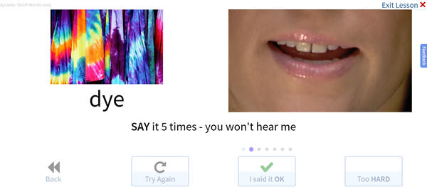
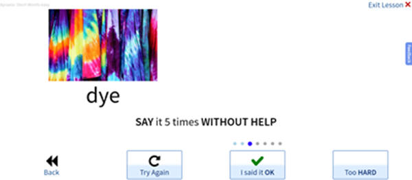
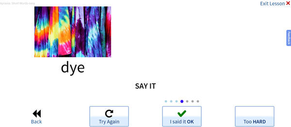
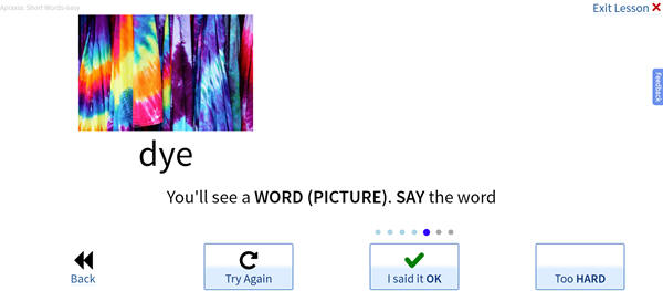
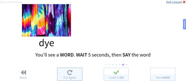
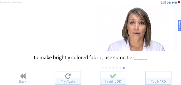
Paul wants to improve his ability to speak words clearly. He normally watches Therapist Tina show him where to place his tongue and lips to make the right sounds. He needs to see a mouth demonstrating the word. Tina uses a process called the Rosenbek Hierarchy which gives Paul a lot of assistance and demonstration then removes that assistance. So first she shows him a photo and a word and says the word while he watches. Once he can successfully repeat it back clearly, he proceeds to the next step for that word, and gives him less assistance, making the exercise more challenging. The goal is to get to the final step where he can say the word in response to a cue. So if the word were apple the goal might be for him to say apple when prompted with “it’s as american as baseball and ___ pie”.
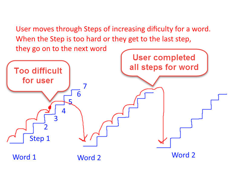
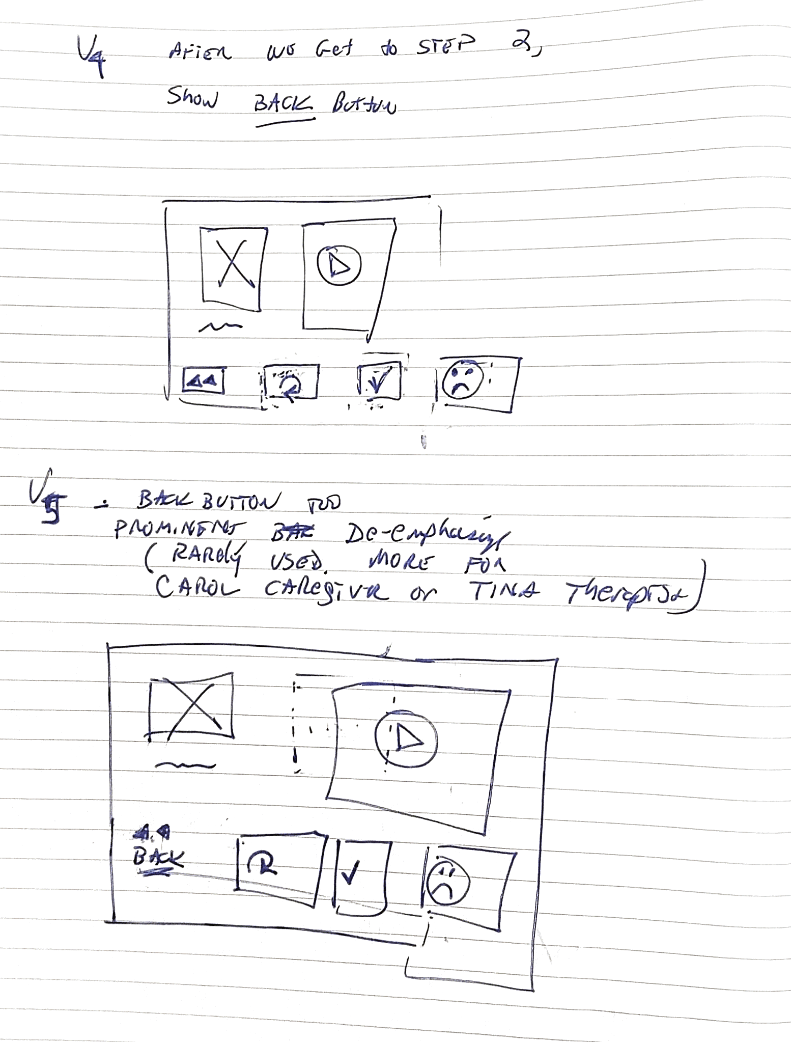
There are 6 additional Steps, with less and less assistance (removing the video hint, htne removing the text, etc.). We'll only show the background sketches for the first step.
Full Assistance
At this point the previous design was implemented and live. I do
not have a copy of that previous version.
This was our beta release
version. I then performed a Usability Test on the live program
Usability Test Results
Goal: Make UI clearer so that users go through each Step they can do, and go to the Next Word when they reach their limit or finish all the Steps.
Iterated again with wire-frames.
Ideas: Simplify the button names. Focus on User-Centric language, or even better, User-Outcomes language.
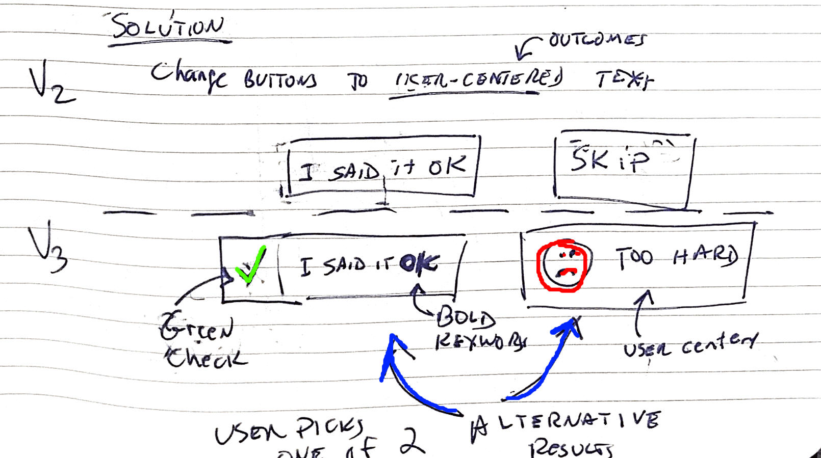
More iteration on Interface
Note: the software developer did not implement the icon specified for the "Too hard"
Final Design with buttons disabled while video is playing.
(Disable buttons prevent Paul the Patient from clicking them while
the video is playing)
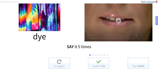
78-89% of test subjects reacted successfully.
89% of users clicked the "Said it OK" button appropriately in a 5 Second Usability Test. (Recruited participants from Facebook Stroke Survivor's group).
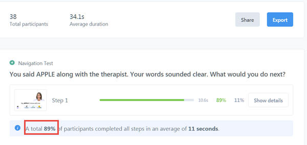
78% of users clicked the "Too hard" button in an appropriate scenario in a 5 second usability test I peformed.
However, I discovered a new problem:
When the first lesson starts
they are not always prepared to watch the video.
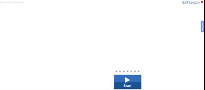
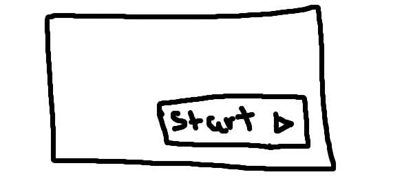
Solution: Use Progressive Disclosure: Display only the "Said it OK" button with text "Start"
First Step, updated with Progressive Disclosure.
When they click the
Start button, the first Step for the first word begins.